
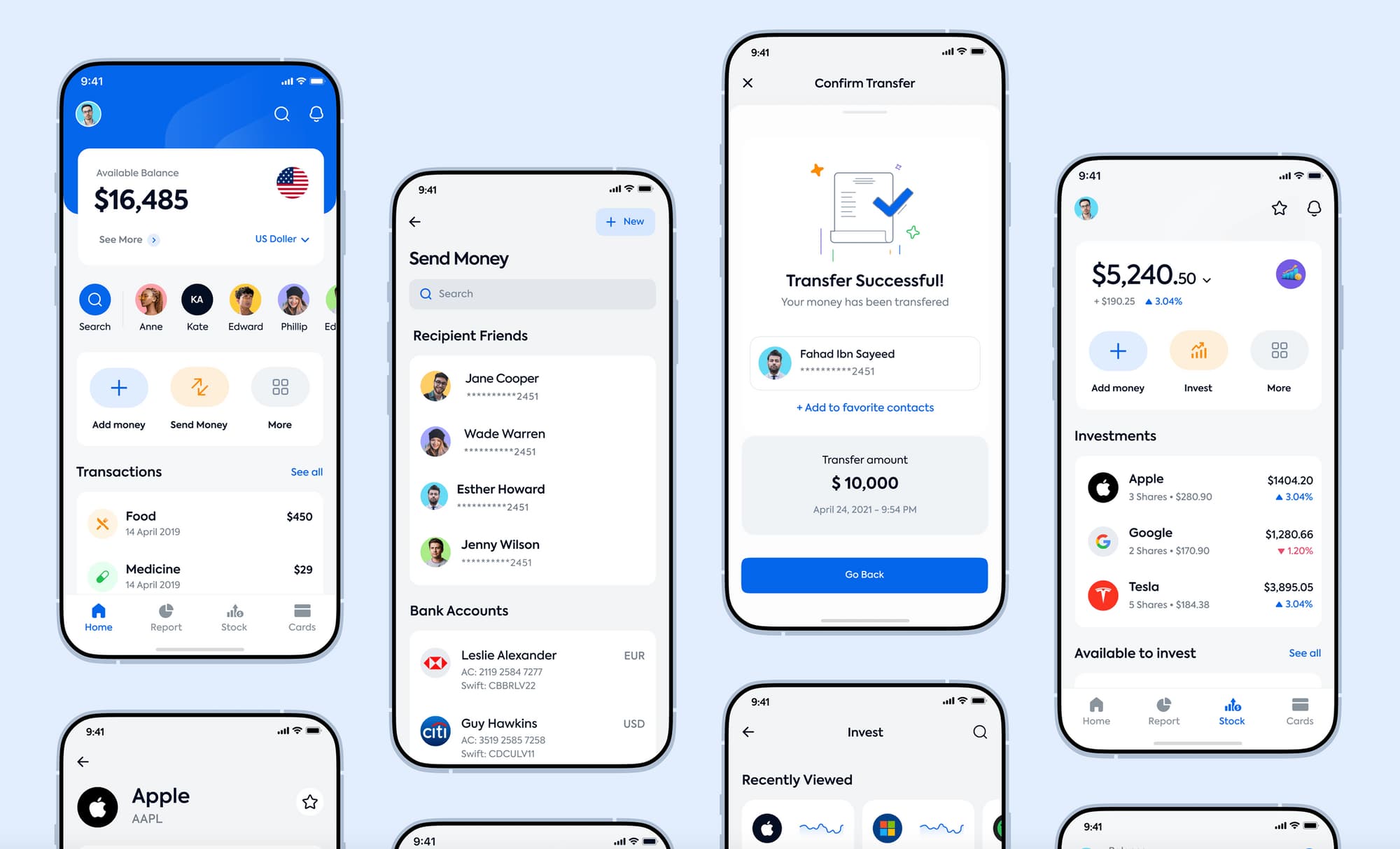
A UX designer needs to be able to use professional terms. Otherwise, the workflow will be greatly slowed down. There are a lot of confusing but interesting concepts, terms, and jargon in UX.
If you have a terminology guide it is easy to follow UX principles, and without it, you can get lost and feel unprofessional. To simplify the work, we have developed a glossary. It is a dictionary of required terms. Such a valuable tool is perfect to start learning about UX. Our team has collected 20 key terms that are mandatory for use and arranged them in alphabetical order.

Above and below the fold
These designations refer to the content and its location: at the top or bottom of the page. Above the fold is convenient for the user and he does not have to scroll the page to find information. Below the fold is the content that is visible after scrolling the page. UX allows you to place it correctly depending on its importance.
A/B Testing
It is a method of testing several designs to determine which interpretation is better. With A/B testing, you can only change one design aspect. It helps to understand what influenced the result.
Accessibility
About the key principles, tricks, and tools of this concept you can study in the glossary: Accessibility.
Affinity Map
The tool's second name is the Affinity Diagram. Designers use it to organize and interpret customer research results. It is how they get data that is not measurable and designers apply thematic analysis. They can poll ten users and already generate a map on similar topics. For example, you asked people about their favorite perfumes. Then you sort them by aroma (floral, citrus, or musky).
Breadcrumb
This navigation chain or system is an auxiliary tool for customers, as this feature allows clients to understand where they are on the site. For example, you are on a shoe store site and the navigation shows how you got to a certain section through links: Home page > Women > Sandals
Clickstream
It is a click analysis tool that tracks customer behavior and analyzes website visits. The UX designer monitors user interaction with the site, that is, keeps track of which pages users visit and their click sequence. In other words, where do customers come from and where do they go.
Customer Experience (CX)
CX encompasses the entire user experience as he/she interacts with a product, brand, or service. It is also a customer feeling when confronted with the systems, employees, or channels of the supplier. UX provides an understanding of the CX concept, even though they are two various areas. More details you can find on the links: B2B customer experience and B2C customer experience.
Customer Journey Map (CJM)
Designers use this tool because it allows them to see what clients want. This map shows the customer's history and user experience. It shows the motives, requests and feelings of the client. For example, if a customer uses a booking site, then the customer path looks like this: search - booking - registration - accommodation - reviews. You can read more in the article with explanations and graphics: What is a Customer Journey Map?
Flat, Interaction, and Iterative Design
The Flat design pays attention to the use of two-dimensional components with bright colors and the whole interface is based on simplicity.
Interaction design aims to create an interface with logical behavior and action.
Iterative design is a methodology with no clear start or stop. Such a cyclical method consists of planning, prototyping, implementing, validating and iterating the process.

Focus group
You can read about the market analysis method here: Focus Group
Gestalt laws
Gestalt is a principle from psychology that helps to understand people's visual perception. In design, it is great for shaping the customer experience. For example, people perceive distant objects more holistically rather than in isolation. Such laws help to improve site visuals.
Golden Ratio
It is a tool for creating balance in design, which has happened since Ancient Greece time. This mathematical ratio is used because our eyes like it. The golden ratio is needed for creating logos, iconography, and typography. Its value is 1.618. In a rounded percentage, whole parts proportions correlate as 62% to 38%.
Ideation
Idea generation techniques and tips are described here: Ideation
Mockup
It is a product model and a simplified version of a digital product. Such a three-dimensional model allows you to visually demonstrate the design and evaluate how it will be in reality before production. Due to mockups, a product idea is easily accepted, and its creation process is easier than creating a prototype.

Minimum Viable Product (MVP)
It is the minimum skeleton of a product or service that engineers can already launch for user testing. Taking into account the client's notes, the product is formed further. On our blog, you can read an instructive article about UX research in building an MVP.
Pain points
These are problems of clients' interaction with the goods and services. Customer experience plays an important role in understanding pain points. When a designer defines them, he can create an intuitive design.
Prototype
It is a detailed plan of the web page. Designers create it to focus on page meaning, content, and interface. The entire prototype design is aimed at making a concept, not a graphic aspect. A prototype shows client interaction with the interface, where the customer can test the basic site functions. The interplay is modeled to fully simulate the product.
Also, the prototype is interactive and low-precision. You can read more about them in our glossary at the links: Interactive prototype and Low-fidelity prototype.

User-Centered Design
You can explore this design process and learn tips and tricks in our glossary: User-Centered Design.
User Engagement
It shows the intensity and frequency of product or service used by clients. So the designer understands the benefits that customers receive from the site.
Wireframe
A detailed framework essence description and the steps for its implementation you can find at the link: Wireframe.
Conclusion
We have considered the basic terms that are necessary for learning and understanding. But there are many more, to learn more about them go to our glossary and blog. The glossary contains illustrations and tips on how to use the tools, and the blog details all the key points.
-1.webp)