

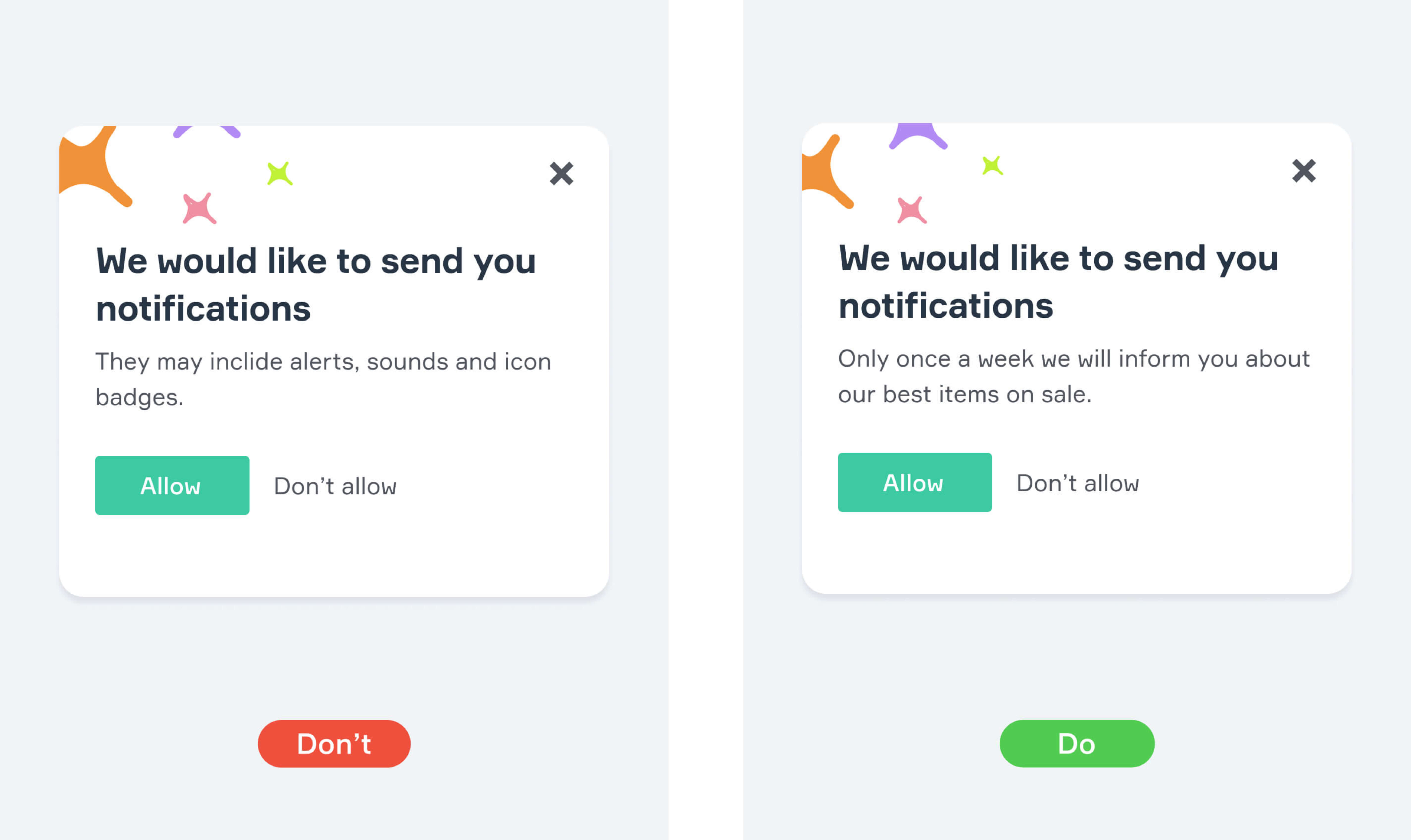
Notifications
Notifications are system status messages which alert users about current events. We need them to inform the user or to encourage him or her to perform certain actions.
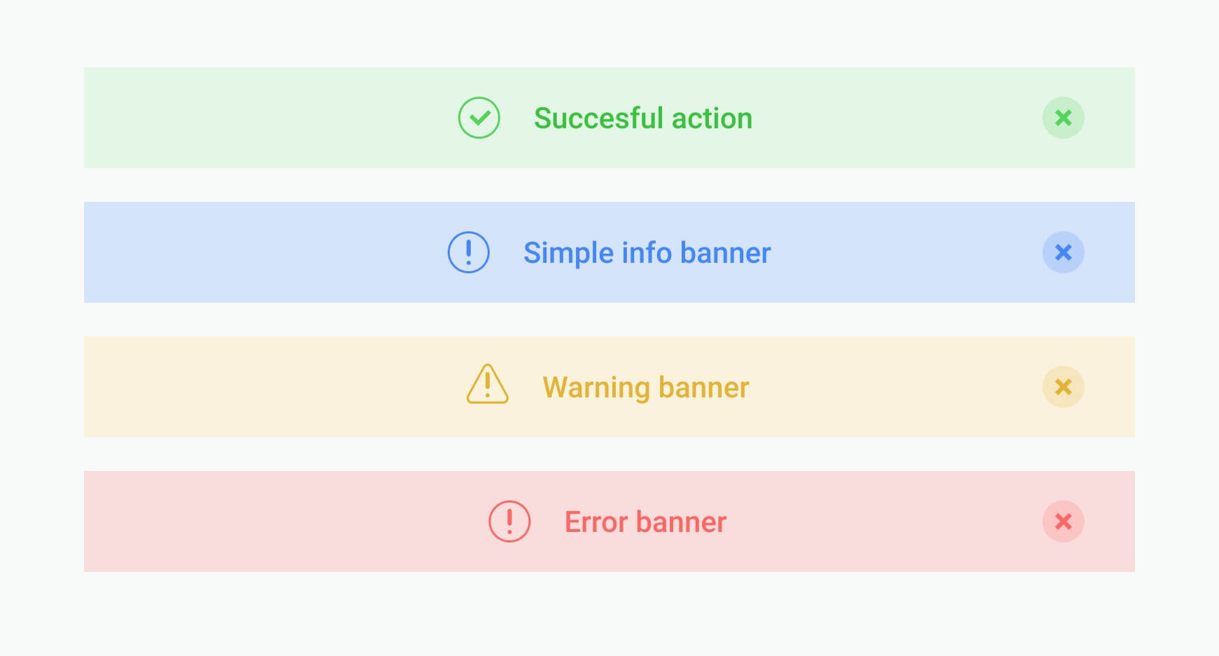
Notifications can be different. From alerts, error messages, confirmations to announcements and acknowledgments. It can provide information to users, provoke them to perform actions or assist in performing tasks. They exist in different forms: persistent or non-persistent, pop-up, banner, dialog.
No matter what purpose a notification serves, it shouldn’t be annoying.
Designing Great Notifications
1. Define Purpose
If you can avoid notification, avoid it. Before designing any notification try to understand when and how it can help users.
When it comes to apps, It is also important to explain to users why they need your notifications.
2. Pay attention to color and icons
Basically, there are three attention levels of all the notifications: high, medium and low. High-attention notifications are errors, confirmations, exceptions. Medium are acknowledgements and warnings. Low-attention notifications are status indicators and success messages.
Notifications of each level need their own design — iconography and colour. It is okay to make notifications different but in styleguide.
3. Find the right placement
It is better to avoid places where notification can ruin the interface. For example, messages can not hide navigation elements. It is better to place notifications at the corners, top and bottom of the whole design system.
4. Check the UX copy
It should be as simple as possible. Make sure that it is easy to read and comprehend. If you add actions, they should be obvious. More about cool UX Copy — here: 8 tips that can help avoid common mistakes.
5. Let users get rid of notification
And make this action as simple as possible. The close button is an obligatory element of any notifying message.
You should also consider an option to mark notifications with Do not show again. It is important when it comes to informational banners.
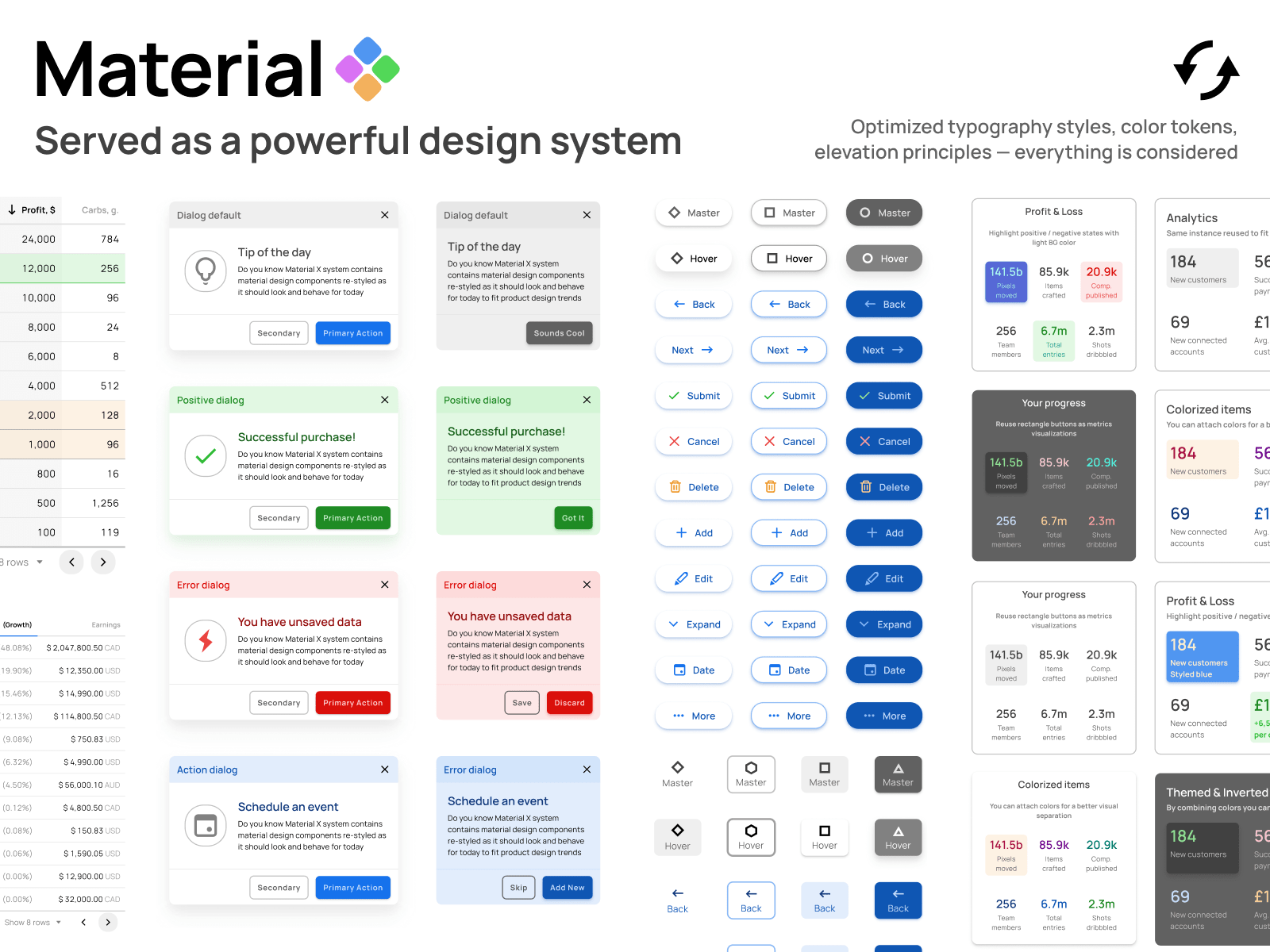
UI Kit
UI Kit is a set of design components. It includes fonts, icons, buttons, colors and documentation. You can make your own UI Kit, but it is much more simple to use the one made by another designer or a team. Commonly, is a Figma or Sketch file.
3 Reasons to Use It
- To improve design consistency. It is very important when you work on a big project with a lot of elements.
- To help developers. The more consistent design is, the easier it is for them to work on a product. UI Kit is also helpful for designers who work on new projects inside the product.
- To speed up product design and development. Instead of creating components you can use ready ones.
How to Find a Good UI Kit
- Format. If you work with Figma, use Figma Files. Yes, you can use Sketch one, but it is very likely that elements will not look well in Figma.
- Typography. Designers need texts. That is why you should check the typography. In a good UI Kit you’ll find all the fonts, their weight, height and size, hierarchy. All in all, you need a system with all the possible styles.
- Colors. The more colors you have, the easier it is to work. For example, you create a design for an online shop. The client doesn't know which colors he wants. In this case you can show two or three versions of the project. It doesn’t take much time, if there are different color pallets in a UI Kit.
- Icons. Good UI Kit includes enough icons. This can save your time. Instead of searching or creating new icons you can use the ones in Kit.
- Elements. Here is a list of all elements you can find in a good UI Kit. In most cases you need them all:
- Button and button groups
- Entry fields
- Checkboxes
- Pagination
- Toggles
- Tabs
- Labels and badges
- Tabs
- Warnings and alerts
- Pop-ups
- Popovers
- Notifications
- All the navigation elements: menu, bars, tabs, breadcrumbs etc.
- Hints
- Preloaders
- Footers
- Widgets
These are the most common components, but you may need more specific ones. This depends on the type of your project. For example, you can find UI Kits created for e-commerce and blogs.
Structure
A good UI Kit has a good structure where it is easy to find all the elements by names. Good naming is often a key to success.
Controversial
You don’t need a UI Kit if you work on simple projects such as landing pages. Although, if you are a freelancer UI Kit may be very helpful for your work as it can save a lot of time for you.
UI Kit is necessary when you work on a big project with big teams. It is very helpful for new people in your team as you can provide all the necessary knowledge about your design system.
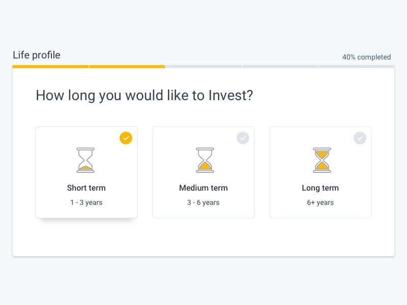
Steppers
Stepper is an interface element that displays progress through numerous steps. Stepper is normally used for navigation: it informs the users about where they are situated in the process, how many steps are left and how much time is needed to complete the form. Active step is usually marked with a color or an icon, as well as the completed step. It is also important to provide the feedback after one step is saved, so the user would know if everything is processing as it should.
There are few types of steps
- Editable, that can be edited within a session, so the users can return to any step anytime before saving all the from.
- Non-editable, that cannot be edited once the step is completed.
- Optional, that can be skipped. All optional steps should be marked so the user could understand it’s not necessary to fill.
Steppers have several varieties as well
- Horizontal, where all the steps are arranged horizontally. It is recommended to avoid using long titles for this kind of placement.
- Vertical, where all the steps are aligned vertically. It is an ideal solution for mobile screens as they have a lack of horizontal space on the screen.
- Linear, where each step should be completed to proceed further. You may include optional steps if needed.
- Non-linear, where the user can start exploring the process from any step and doesn’t need to complete each one.
Speaking about mobile UI, there are some kinds of suitable steppers for the smartphone screen. The main goal here is to adapt the design for smaller space and get rid of useless details such as long text blocks or icons.
- Radial stepper. This one allows to focus on important things (what is the current step, how much is left), reduces the visual noise and provides better readability.
- Dots. You may use this type of stepper as an alternative to save the space when no special titles are needed.
- Progress bar. This is another way to improve the mobile stepper from a visual point of view.
Steppers are the perfect way to bring a structure to any form inside of your website or application. You may use these tips to implement it in the desktop or mobile interfaces.
Navigation
Synonyms: navigational components
Navigation is a set of actions guiding users through the app or website. Navigation is important for users’ interaction with your product. Our task is to set the best and easiest route to solving users’ problems. We can do that using many tools, the most popular below.
Top App Bar
It is an interface element including related content and actions on the top of the page. Top app bar can transform into a contextual action bar. It can contain a navigation icon, a title, action items, and an overflow menu. Top bar can also contain imagery, but be careful using it.

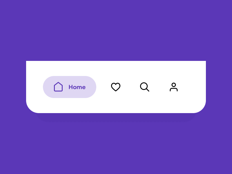
Bottom Navigation Bar
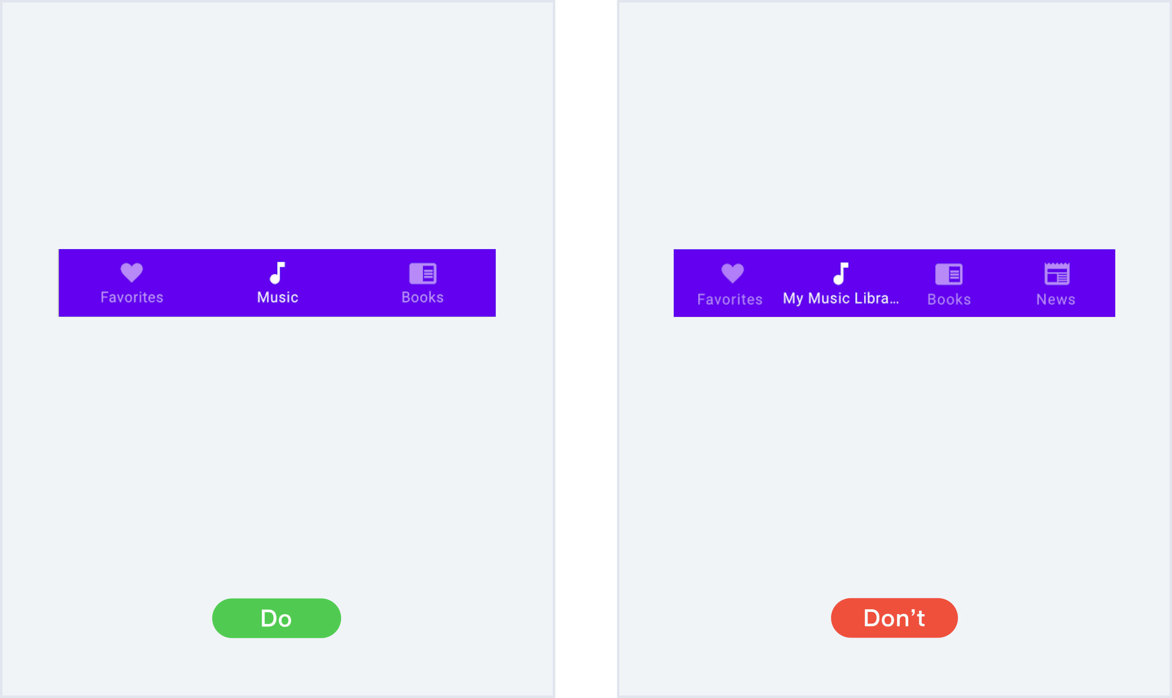
Bottom navigation bars allow quick switching between sections of an app. They display from three to five options at the bottom of the screen. The icons represent each option and sometimes have a text label.
Here are some general rules for bottom bars.
- Use only 3-5 elements.
- Use short text labels.
- Don’t use multiple colors.
- Avoid using both the bottom and top bars as it may confuse users.
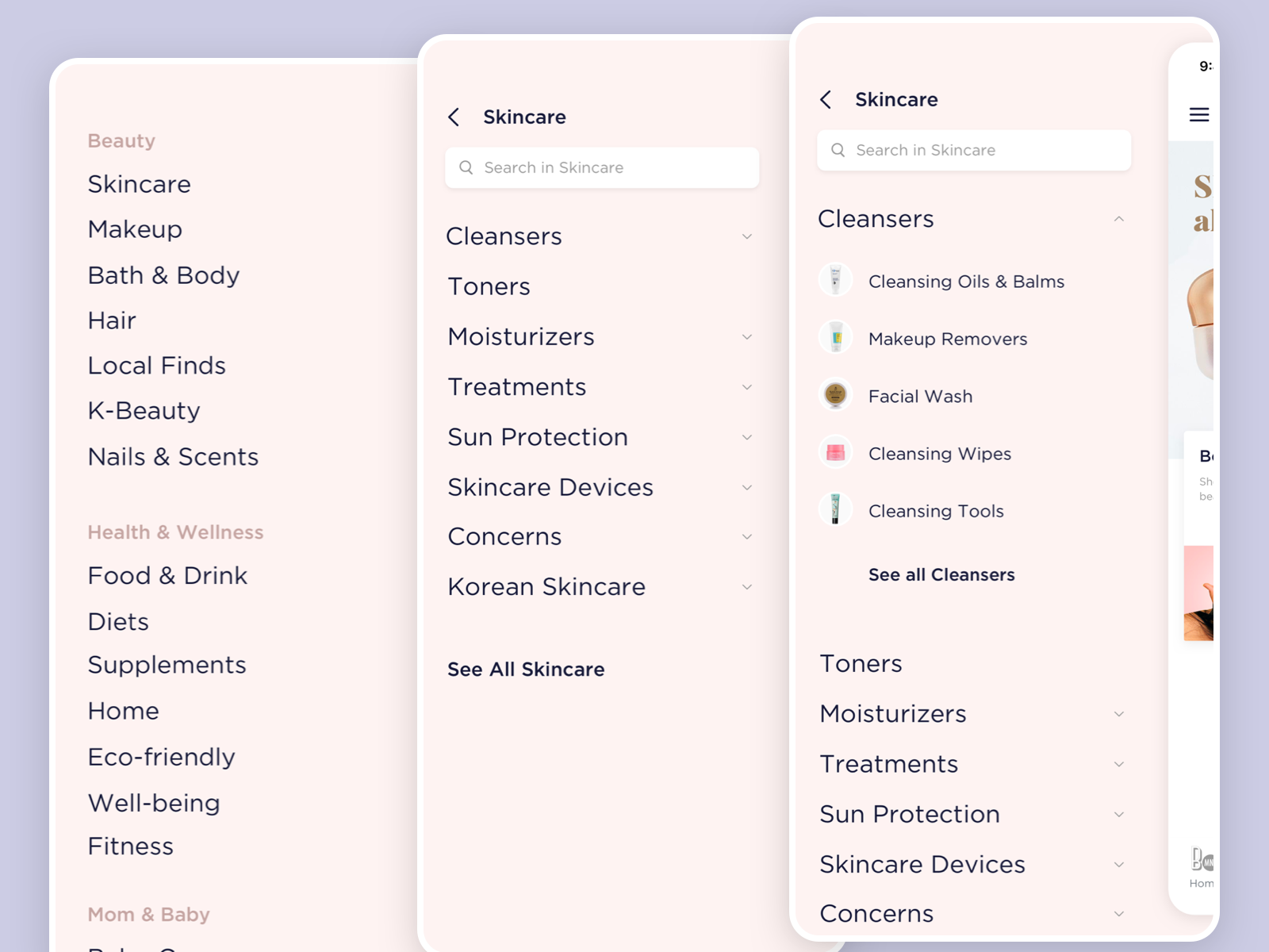
Navigation Drawer
Navigation drawers contain main navigation destinations. We use them for apps with more than five destinations, unrelated destinations, or multiple levels of navigation.
Here are some basics for this element:
- It should be permanently on-screen or controlled by an icon.
- It can open from the left side of the screen or the bottom when combined with the bottom navigation bar.
- The text labels should be short and clear.
- We can use icons or leave the text labels without them
- Don’t use the same icon for different destinations.
Tabs
Tabs represent a single row on the top side of the screen. They allow users to move between related and on the same level of hierarchy options.
Here are four tips for the tabs’ design:
- They can be fixed or scrollable. Scrollable tabs should have some tabs off-screen until scrolled.
- We can use icons and text labels or both.
- Text labels should be short and clear.
- Use color change and underline to highlight an active tab.
Breadcrumbs
Breadcrumbs show the user’s current location. It helps users understand better the structure of the site. There are some rules for making your navigation readable:
- Show the full navigational path.
- Progress from the highest level to the lowest.
- Use page titles as your breadcrumb titles.
- Collapse breadcrumbs if they have more than four items.
- Make the last Item unclickable.
Tip's & Tricks
- Use clear labels.
- Make your design simple. Avoid unnecessary design elements and animation.
- Make the interactive elements look clickable.
- Design from left to right. Users are used to it, so put your menu or drawers on the left side of the screen.
- Communicate user’s location. Highlight the currently selected section. Consider using breadcrumbs.
Squirclemorphism
Mobile design trend in which squircles — special forms — are used. This trend appeared with the release of iOS 7, where application icons were masked with squircles. Now this shape is used by web designers outside the iOS platform.
How to Draw a Squircle
In Figma
To create a squircle, enable the Corner Smoothing option. To do this, click on the corner radius icon and open the detailed radius settings for each corner. Here you will see the required parameter in the menu with three dots. You have to click it and set the parameter from 60 to 100% — the highest value is typical for iOS design. You can also use this plugin in Figma to create a squircle.
In Sketch
To reproduce the squircle shape in Sketch, you need to create a rectangle-shaped layer with rounded corners. You can set the radius of these corners in the Inspector panel — it is on the right — just select the Smooth Corners option from the Radius menu. That's all.
Hamburger icon
Synonyms: hamburger button, triple bar, menu button, burger icon, burger menu, top menu button, head menu button, collapsed menu icon
Is a control element placed in the top corner of the user interface that visually looks like 3 horizontal lines and from a bird's-eye view looks like a nice burger.
Controversial
That little three-lined button is the devil. Whether you call it a side menu, navigation drawer, or a hamburger, hiding your features off-screen behind a nondescript icon in the corner is usually a poor mobile design choice. Interaction theory, A/B tests, and the evolution of some of the top apps in the world all support the same thesis: the hamburger button is bad for engagement, and you should probably replace it with a tab bar or other navigation scheme.
- Not clear that this is menu
- Hides navigation
- Extra action
- Lower discoverability
- Less efficient
- Clash with Platform Navigation Patterns
- Not glanceable
- Makes pages less important
- Low engagement
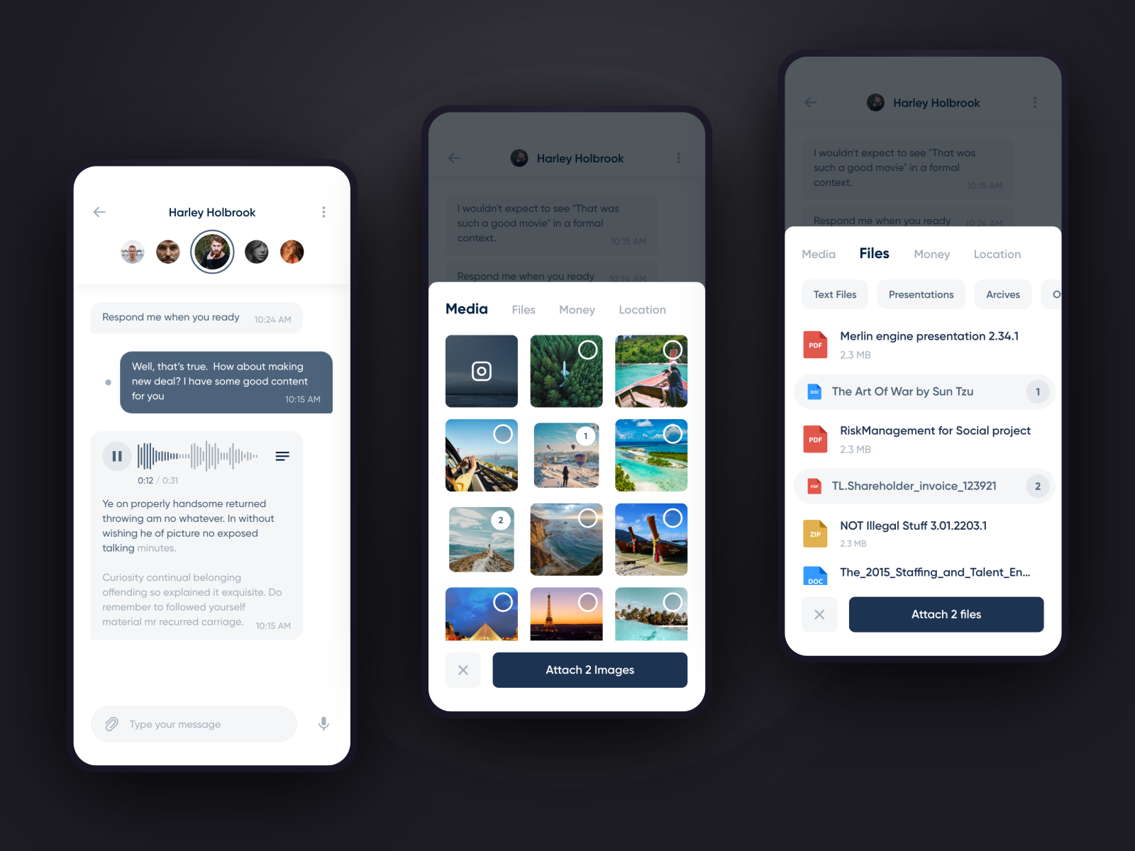
Dialogs
Synonyms: dialog box
Each day users perform thousands of actions. Dialogs as an UX tool can whether simplify the user’s life or get it complicated – and that is when a qualified designer should step up.
We all know dialogs as overlays that require user response. It is a conversation between the system and the user which informs the user and forces to take action, brings attention to critical information and requires to make decisions without taking the user away from the context of the current screen.
Structure
Each dialog has the same construction:
- Title. The purpose of the title is to characterize the type of the message briefly and clearly.
- Content. Content consists of a message that describes the issue in a human language that the user will understand, probably without any specific system terms. Keep it short and user-friendly. The main goal here is to deliver the information and to get an action from the user.
- Action Buttons. This leads us to action buttons. It is recommended to have only two possible action buttons in the dialog and one of them should always be “x”, “close” or “cancel”. Third action as “learn more” can navigate the user away from the dialog and leave the action not accomplished. Avoid using “yes/no” buttons as actions – that doesn’t have a clear message and it is always better to apply the action names instead.
Types of Dialogs
- Modal Dialogs. Disable the current page content and oblige users to make an interaction to continue. They can be used only for very important issues (delete an account or document, agree to terms and conditions) and cannot be closed without making an action.
- Non-modal Dialogs. Just show information without disabling the interface and can be escaped.
Tips & Tricks
Although we already discussed construction and specific states of dialogs, you can also use some hacks to upgrade this element in the interface:
- Limit the number of dialogs unless it is absolutely necessary, use them sparingly – too many interruptions are bad. Sometimes it’s better to work with an inline expansion instead of a dialog.
- Don’t forget about confirmation messages and visual feedback to indicate when the user action has been processed and complete.
- Avoid multiple forms within one dialog. Sometimes it is better to create another page for this flow.
- Don’t make your dialog too long and avoid using scrollbar. Keep it short and simple.
- Background overlay is important. It brings attention to the dialog, allows the user to understand that he or she can go back to the screen afterwards. Be careful with tinting though, don’t make it too dark or too light.
- A dialog should always be predictable and be opened after the user did something on a page, not spontaneously.
- If you need to insert “Learn more” information it is better to show it as an expansion inside the dialog, not as a link to the FAQ page, so the user’s attention won’t be distracted with another tab in the browser.
You’ve just read a lot about dialogs, but the main thing to remember is that the user experience is about humans, not about technology. You have an opportunity to improve your product so go ahead and use these tips to create another user-friendly interface!
Charts
Synonyms: flow chart, pie charts, bar chart, diagram
The chart or diagram is a graphical representation of data. We use it to make data easier to read. There are a lot of different ways to visualize your data. Here are the most popular types of charts.
Column Charts
Column charts are effective when it comes to a set of data that you can split into different categories. But they lose their effectiveness if you don’t use them well. Here are two examples.
Bar Сharts
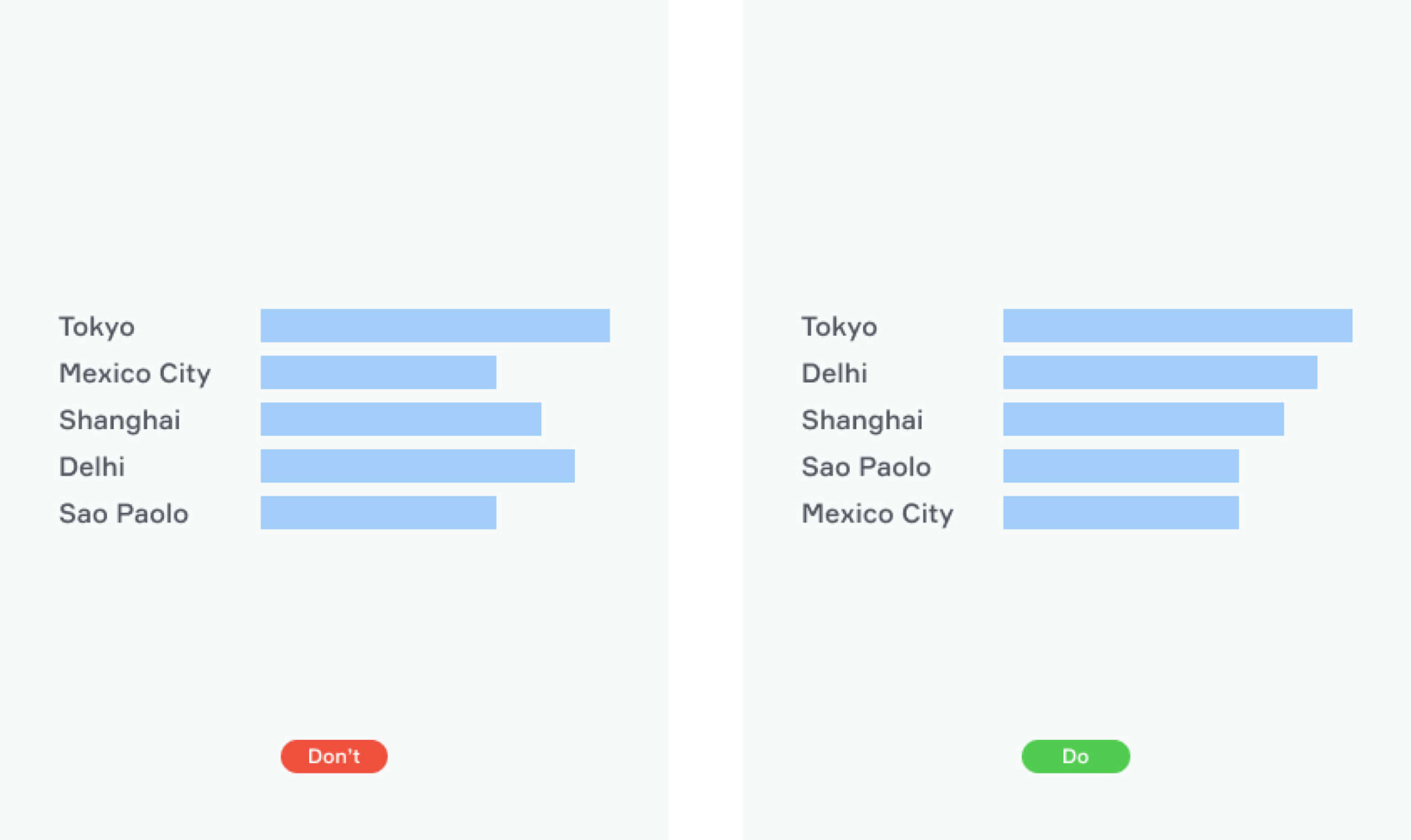
Bar charts are horizontal column charts. They are good for comparing percentages among sets of data. It is better to sort them for more clarity.
Pie Charts
Pie charts use slices to show relative sizes of data. They are good to understand how the respective pieces relate to the whole. There is a simple rule to make them look more logical: the largest share should start at 12 o’clock and go clockwise.
Line Сharts
This type of chart is good for visualizing trends over periods. The vertical axis displays a numeric amount, and the horizontal axis indicates related factors. Line charts are always easy to understand, but you can make them look even better.
Tips & Tricks
- Consider ordering your data to make it easy to read. You might sort it alphabetically or by value
- Arrange data intuitively. Choose natural intervals when naming your axes. [0, 20, 40, 60, 80, 100, 120] is better than [0, 30, 60, 90, 120]
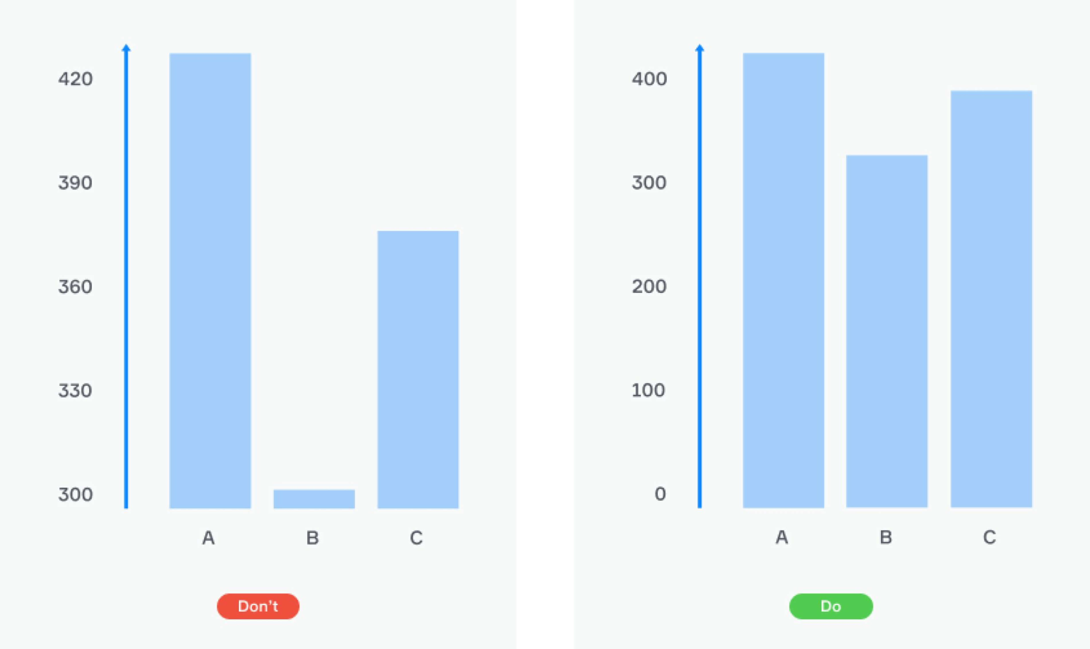
- Start your bar charts at zero to make them properly proportional
- Use contrast colors to highlight the difference between data series
- For long labels, use a horizontal bar chart instead of the column chart. Don’t make your readers turn their heads
- If your pie chart has more than five slices, consider showing your data in a bar chart
- Don’t forget to add a title and a clear legend
- Keep it simple. Don’t fill your chart with unnecessary data labels, 3-D, or other chart junk
Picker
Interfaces can exist in two states: informing and interacting. It’s clear with the first one, but interaction though is quite interesting and complicated. Tools that are usually helpful in this engagement are inputs, dropdowns, and pickers. Let’s dig into some details with the last one.
Picker is a tool for choosing the right date in those forms where it is necessary. There are several kinds of pickers.
Calendar
The most common is the calendar picker. It is an obvious and quite familiar way to select a date which transfers the experience from a real world with paper calendars to the interface of your device. However, this instrument can be a bit uncomfortable if a user should scroll the calendar pages too long to select a period that is far from today.
Tips & Tricks
- Try to always highlight today’s date in the calendar. This will let the user navigate efficiently.
- Mark the previous and next month dates on the calendar page with different color or transparency to make it distinguishable from the current month, or just make an empty space.
- Prevent the user from picking the wrong date: make it unavailable, but not the same color as the previous month dates.
- Sometimes today/yesterday/last 7 days/last month tips can be used along with a calendar option to make the selection process more efficient.
- Don’t forget about the errors: the main recommendation here is using red color to highlight the problem and add an error icon with a tooltip explanation on a hover-over.
Text Inputs
Aside from the calendar, there is text input. It is most often to appear in the DD/MM/YY format (or MM/DD/YY, depending on the culture preferences). This kind of date picker may complement the calendar to make the selection process faster so users both typing dates and get a calendar list with a suitable date range.
Dropdowns
Synonyms: drop-down list, drop-down menu, drop menu, pull-down list, picklist
Is a control element that allows the user to choose a value from a list. Dropdown-menu displays a single value when inactive and a list of values when it’s activated.
Dropdowns are huge. Since 1974 this tiny element helps us in it’s laconic way to pick and choose. But there is a problem of relevance. In SXSW Keynote 2016’ Eric Campbell & Golden Krishna dropped their hilarious lection called «You know what? F**k dropdowns» wherein in a humorous way shows the pastness and illustrates the pain points of dropdowns.
Navigation drawer
Navigation drawer gives the user quickly access top important sections of the interface and represents a part of multi-level navigation. It suits apps and web services with five or more significant destinations, which are often unrelated.
Tips & Tricks
- Clearness is necessary in this element. Use short text labels for sections in the list
- The inner hierarchy of the list reflects the significance of the section: higher importance takes a higher position
- You can use icons or leave the text labels without them
Bottom navigation bar
The bottom navigation bar helps a user quickly get to the desired section or make an action. It is placed at the screen bottom, and usually contains from 3 to 5 options displayed by icons. Sometimes the icons have a text label.
Tips & Tricks
- Make the icons simple and understandable
- Use short text labels
- Make sure that the bar and it’s elements are always visible to the user
- Bottom navigation bar has to be consistent through the entire interface
- It has to contain the most important or most common actions
Scrim
The term refers to the temporary effect of shading, lightening or blurring, applied to any surface of the interface. The word ‘scrim’ came from photography, and means an element, which physically covers lights to make lighting effects. The effect that the scrim does, help to direct attention to other parts of the interface, while the surface under scrim remains available for interaction.
Scrims are used for dialog windows, navigation drawers, push-notifications, and backdrops.


